Visualizing Impact
Research impact can be analyzed and presented through statistics and tables alone. However, there may be cases where research impact is more effectively analyzed through graphs and visualizations, or cases where you would like to present research impact in an attention getting way.
Databases such as Web of Science and Google Scholar automatically generate simple graphs that chart citations. Using these graphs can be a quick way to visualize your research impact, but they are often limited to displaying one researcher at a time.


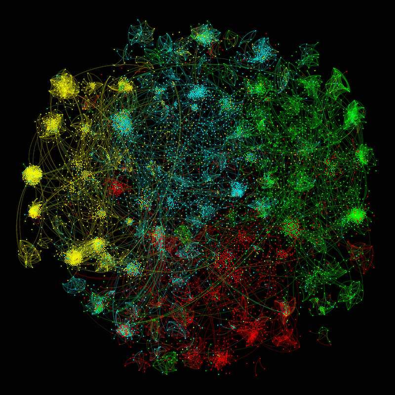
More complex visualizations, such as network graphs, may display research impact over multiple people, departments, or even disciplines. For example, the Hive Research Lab, a research collaboration between Indiana University and New York University that partners with the Mozilla Hive NYC Learning Networks, wanted to explore different visualizations of their grant funded programs and their impact. One visualization was a collaboration network (below), which was created to show how the different programs collaborated each other, while another visualization demonstrated the relationship between grant amount and youth engagement.

The Higher Education Funding Council for England also wanted to track the impact of research in the UK. Partnering with the Policy Institute at King’s College London and Digital Science, they created a searchable website based on a database of nearly 7,000 papers that demonstrate research and their impact. In addition to this searchable website, they also created an interactive visualization of research by creating a network diagram of these papers that were then clustered into subject areas (see below). This revealed areas of research strengths, weaknesses, and interdisciplinarity on a national level.
Below are some software, programming libraries, and other tools that can be used for visualizing research impact:
A modular toolset specifically designed for the study of science. It supports the temporal, geospatial, topical, and network analysis and visualization of scholarly datasets at the micro (individual), meso (local), and macro (global) levels. For the Sci2 manual, please see this link note that Sci2 is no longer being updated and will not work on current operating systems on Mac.
- Gephi (free)
An interactive visualization and exploration platform for all kinds of networks and complex systems, dynamic and hierarchical graphs. Works in synergy with Sci2 for complex analyses.
- D3.js (free)
D3.js (Data-Driven Documents) is a JavaScript library that allows you to create and control dynamic and interactive graphs in a modern web browser. It makes use of common web standards such as SVG, HTML5, CSS and JavaScript for data visualization.
- VOSviewer (free)
VOSviewer is an application that can be used to create, view and explore maps based on network data. VOSviewer is primarily intended to be used for analyzing bibliometric networks. The program can for instance be used to create maps of publications, authors, or journals based on a co-citation network or to create maps of keywords based on a co-occurrence network.
- Rimpact (free)
Rimpact is an example of how you can write custom code to parse and analyze bibliographic records and generate visualization graphs for research impact. Rimpact was written in the Ruby programming language, but the concept can be applied to any programming language you are familiar with.
A guide to visualizing bibliometric data using Web of Science, Sci2, and Gephi
If you are interested in creating and visualizing a collaboration network based on the authors you or your department have published with, the following step-by-step guide with screenshots will help you download bibliometric data from Web of Science, process and clean the data in Sci2, and visualize a network graph within Gephi.
For more information or assistance, email Library Impact Metrics team or Ask Us.